
In today’s digital world, having a mobile-friendly website is very important. More people use their smartphones to browse the internet than ever before. This means businesses need websites that look good and function well on all devices. When it comes to designing for mobile, two main approaches are Responsive Design and Adaptive Design. But which one is better? Let’s explore both and find out the best choice for mobile websites.
What is Responsive Design?
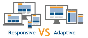
Responsive Design is a web design approach that makes a website adjust automatically to different screen sizes. This means a single website layout changes its shape and size depending on whether you are viewing it on a desktop, tablet, or smartphone.
How Responsive Design Works
- It uses flexible grids and layouts that resize elements based on the device’s screen size.
- The website content adjusts automatically to fit any screen.
- CSS media queries help detect the screen size and apply different styles.
- There is only one version of the website, which changes its appearance depending on the device.
Advantages of Responsive Design
- Better user experience: The website looks good on all devices, making it easy to use.
- Cost-effective: Since only one website is created, there is no need to design separate versions for different devices.
- SEO-friendly: Google recommends responsive design, which helps websites rank better in search engines.
- Easier to manage: Updating content is simple because changes are made in one place.
Disadvantages of Responsive Design
- Slower loading times: Some mobile devices may load unnecessary desktop elements, making the website slower.
- Complex design process: Designing a fully responsive website requires extra effort and testing.
Many businesses today prefer Responsive Design because it is flexible and works well on all devices. A leading Website Development Company In Udaipur can help businesses create a responsive website that enhances user experience.
What is Adaptive Design?
Adaptive Design is a web design technique where different versions of a website are created for different devices. Instead of one layout adjusting to all screen sizes, multiple layouts are built to fit specific screen sizes like desktop, tablet, and mobile.
How Adaptive Design Works
- It uses pre-defined layouts that are designed separately for different screen sizes.
- The website detects the device and loads the appropriate layout.
- Different HTML and CSS versions are created for various devices.
- Designers create fixed layouts rather than flexible grids.
Advantages of Adaptive Design
- Faster loading times: Since only necessary elements are loaded for each device, the website performs better.
- Optimized experience: Each layout is designed to give the best experience on a particular device.
- Better performance for old devices: Adaptive design allows customization for older devices with limited capabilities.
Disadvantages of Adaptive Design
- Expensive and time-consuming: Since multiple versions of the website must be created, the process takes more time and resources.
- Difficult to maintain: Making updates requires changing multiple versions of the website.
- Not as flexible: New screen sizes may not be supported unless new layouts are created.
Businesses that require a highly optimized experience for different users may prefer Adaptive Design. A professional Mobile Web Design Company In Udaipur can help businesses choose the right approach based on their target audience.
Key Differences Between Responsive and Adaptive Design
Flexibility
Responsive Design: Highly flexible, adjusts to all screens
Adaptive Design: Pre-set layouts for specific screens
Development Time
Responsive Design: Faster, requires only one website
Adaptive Design: Slower, needs multiple versions
Cost
Responsive Design: More affordable
Adaptive Design: More expensive
Performance
Responsive Design: May be slower on mobile
Adaptive Design: Optimized for each device
SEO Benefits
Responsive Design: Google recommends it
Adaptive Design: Less preferred for SEO
User Experience
Responsive Design: Consistent across all devices
Adaptive Design: Customized for specific devices
Which One is Best for Mobile Websites?
Both Responsive and Adaptive Design have their pros and cons, but for most businesses, Responsive Design is the best choice. Here’s why:
- It provides a better user experience across all devices.
- It is easier to manage because there is only one version of the website.
- It is more cost-effective since businesses do not need to create multiple versions.
- Google recommends Responsive Design, making it better for SEO.
However, for businesses that need a highly customized experience, such as e-commerce websites, Adaptive Design may be a better option. It allows for better performance and optimized experiences on different devices.
For businesses looking to build a mobile-friendly website, Udaipur Web Designer is a trusted name that can help. Whether you need a responsive or adaptive website, working with an experienced Website Development Company In Udaipur ensures that your website is well-optimized for all users.
Conclusion
Choosing between Responsive and Adaptive Design depends on the needs of a business. Responsive Design is the best choice for most websites because it is flexible, cost-effective, and SEO-friendly. Adaptive Design, on the other hand, is useful for businesses that require customized experiences and better performance on specific devices.
If you are looking to create a mobile-friendly website, a reliable Mobile Web Design Company In Udaipur can guide you through the process. With the right approach, your website can attract more visitors and provide an excellent experience for users across all devices.